I thought I would use this time with you to share my love of sketches! I don't know if you guys have caught the sketch "bug" but I ADORE them--There's just something about having some of the design work taken care of that makes me feel more laid back about doing the fun part: Embellishing!
In fact I am so in love with sketches that I got to the point where I had oodles of them filed away on the computer (and printed out), but it got to the point where I found it difficult to wade through them when I needed just the right sketch for my particular photos. That's when I had the brilliant (if I do say so myself) idea of printing out all of these sketches as wallets. You can fit 9 single page layouts at once when printed wallet sized or 4 double page layouts when printed in 4x6 size to an 8.5 x 11 piece of paper. How cool is that?!
After printing them I set to work trimming them down. I realized I could usually trim three sheets at once with the right trimmer to save on time, but this entire project is great mindless work to do while watching tv or the later steps even work great while on the go at a kid's sporting event.
After my sketches were all cut apart, I started separating them into piles by the number of photos they have. At the office supply store I found huge stacks of rainbow colored 4x6 index cards--I chose a different color for each set of sketches (and started to repeat some of the colors as the sketches dwindled in the higher numbers). The wonderful thing about using 4x6 index cards is they fit beautifully in photo boxes! Here's a peek at what my box looks like:
(Please excuse the fact that I still haven't gotten around to labeling the tabs) I decided it might be nice to also quickly run the index cards through my printer like a 4x6 photo adding the little subtitle to the cards telling the number of photos on each card.
After I had my sketches narrowed down by number of photos I realized it would also be cool to take it one step further and try my best to separate them out by the orientation of the photos. For example for three photo layouts, I would have sub-categories of 3 Horizontal, 3 Vertical or 2 Horizontal/1 Vertical, etc. It took a bit more work, but really not much more and I have to say it WONDERFUL to go to my box and find exactly the stack of perfect sketches I'm looking for in just seconds. I glue my sketches to both the fronts and backs of the cards to stretch supplies and conserve on space. These are what my cards ended up looking like:
Well, hopefully that was a bit of inspiration to wet your appetite! Now I thought I would share a sketch that design team leader Jen Evans created and challenged me with. Isn't that inspiring?!
Sketch created by Jennifer Evans for Craft Warehouse
So here is my take on her sketch. I love how you can use sketches as a jumping off point for your creativity. I tried to stay true to the most basic bones of the sketch, yet I still altered it in several places to fit my style and the product I wanted to play with...
For this layout, we were asked to use supplies from the new Holiday "Saint Nick" collection from Fancy Pants, Petaloo Flowers and some red tinsel fiber. Each of these fun papers are double sided and I was really drawn to the red, silver and ivory color scheme with accents of green for my layout so I looked for ways to pull from those colors when selecting my exact papers and embellishments.
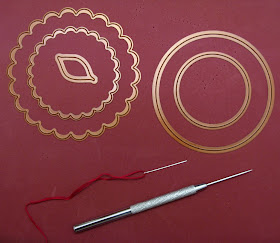
I also added a few basic supplies of my own such as Red Bazzill cardstock, Making Memories black glitter alpha stickers, American Crafts metallic Glitter brads and embroidery floss (all available at your local Craft Warehouse). ;) And the following tools: Spellbinders Circle, Scalloped Circle and Leaf dies, Paper piercer, embroidery needle and a foam stamp pad (which I double as a safe surface for piercing with my paper piercer). I love this thing and best of all it's cheap! :)

So today I thought that rather than showing you a step-by-step tutorial on how I created my entire page I would share one of my other passions with you: Stitching! I love all kinds of stitching whether it be by sewing machine or by hand so today I thought I would share some fun ways to stretch your supplies and use things you have on hand to add hand-stitching to your layouts. After setting aside the bracket shaped border, I started by cutting out the leaves from the backside of the paper with all the borders on it.
Then, using my Ranger foam applicator and some Tim Holtz Distress Ink I inked around each leaf to add a little depth and help the leaves stand out against my page background.
Next, I used my paper piercer and foam mat and just freehanded about 6 holes in a straight line down the center of each leaf. These holes give the foundation in which to hand stitch later.
Embroidery floss comes with 6 strands of thread wound together and I wanted to only use the thickness of 3 of the strands for my stitching so I just pulled them apart and divided the floss in half.
After that, it's sort of like those needlepoint cards from when you were a kid. I used a back stitch, but it honestly doesn't matter how you do it because as long as it looks good on the front, that's all that matters. :)
I think it adds such a nice little finished detailed to leaves, don't you?
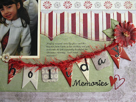
Another one of my favorite ideas with stitching that I don't use nearly enough is stitching my title. Using the free Microsoft font "Script MT Bold" I printed the second part of my title out onto printer paper. I did it in a couple different sizes as I wasn't certain which size would work best for my project.
Then I set to work punching holes by just following the outside outline of the font...
Then came the fun part of stitching. I found it helpful to keep the printer version with the holes nearby so I could refer to it anytime I got confused about where to stitch next (which can easily happen when you have all those tiny holes sitting right next to each other).
Another fun way to stretch your supplies is to use shapes you already have on hand as a stitching template. In this case I used one of the larger heart stickers from the collection to pierce around, but punches and diecuts also work great for this technique too.
I love how you can easily give your layout a cohesive look with this technique by matching your title font to your journaling font! It so fun to create your own accents too when the stickers aren't just right color or look you are going for.
Lastly, I thought I would share another one of my favorite go-to techniques that I used on this layout--Printing on premade stickers and journaling spots.
I start by printing my journaling or sentiment on a piece of printer paper. Then holding it up to the light (whether it be the nearby desk lamp or my window) and I tried to center my sticker tag over the pre-printer journaling--Sometimes this is actually easier by looking through the back of the printer paper and seeing the outline of your tag shape as was the case with this one. Then I just ran my paper through the printer a second time (using the specialty paper selection so that it wouldn't smear too badly on the glossy coated surface). Then after allowing it to dry completely, I just pealed it off and placed it directly onto my layout. So easy and yet it gives your projects such a polished look.
When using a cardstock cutout that doesn't come with adhesive already, temporary adhesive or photo splits work perfectly for this technique too. And here's an up close shot of the finished tag on the layout...
And, just in case you completely forgot what the finished layout looked like after all these photos, here it is again.
Thanks for hanging with me today and I hope I was able to inspire you to try something new. Make sure to check back soon for Jules' fabulous take on another one of Jen's awesome new sketches using these same supplies! :)
Mendi


Very cool, Mendi! Thank you for sharing!
ReplyDeleteSuper job Mendi...love how you shared your sketch box (this is such a wonderful idea) and your photo tutorial is great too (I love all the hand stitching...great idea to use a computer font and the cute little hearts as templates!!!). I also love your take on the sketch...I'm excited to try it out for myself. Your banner is perfect...love the funky red thread...very festive:o).
ReplyDeleteYour projects are always so beautifully put together. Everything you do looks like it is straight out of a book or magazine. Your attention to detail is amazing. Great work again!
ReplyDeleteYou have such a knack for using the patterns in paper to enhance your design! I love your hand stitching ideas and the how to for printing on pattern paper is really helpful.
ReplyDeleteI agree with Jennifer M- your attention to detail is amazing!
Love, love, love all the stitching detail! This is absolutely gorgeous! You did an amazing job with this! Very inspiring!
ReplyDeleteWonderful layout and very helpful tips!
ReplyDelete~Jill