 Hi there... Andrea Ancich here again to give you a little tutorial on the Cameo by Silhouette NOW available in our Salem, Gresham, and Vancouver stores!
First: open a new workspace: When I work on mine, I make sure the grid is on there so I can measure things while I'm working. It's in the upper right hand corner. You can make your grid as big or as small as you'd like.
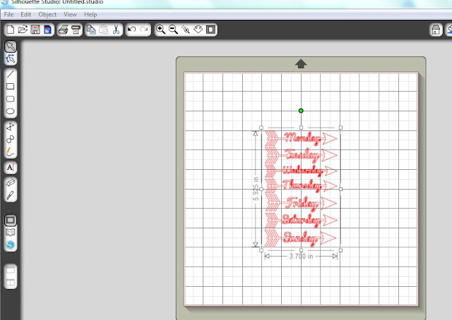
Second: Select the designs you would like to use. (Check out the Silhouette online store for lots of fun designs available).
I chose the arrows knowing I would eliminate all but the Monday arrow; I'll show you how to do that.
I moved them up to the corner of the 'mat' so i would maximize my cutting area.
I right clicked on the design and "ungrouped" them. Next I deleted "Tuesday-Sunday".
I decided on a size that would work best for my project, knowing I could make it bigger or smaller if needed.
Next, I selected a text to make my title.
I typed in my title with a default font that my program uses. (Keep in mind that all true type fonts should work as a font to be cut out).
I selected the font, centered it and changed it to a font that would compliment my pages.
After I found the font I like, I right clicked on the words and ungrouped them. This will allow me to move them closer together.
So, I began moving them closer together. Having some of them overlap is ok.
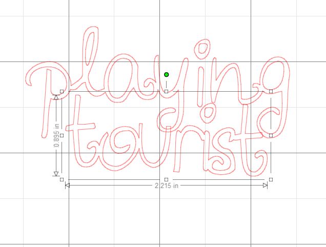
Next, right click and hit "weld". This action will weld your letters together like this one below. This will allow your machine to cut them together, kind of like cursive handwriting.
After you have done your first welding, highlight the bottom word and move it up to make your title more 'title friendly'. too much space is awkward.
After you move it into the place you want it, select it all and weld together again.
You can see where the pieces were overlapping, they are now joined. This will cut out just as it looks on the screen. You can see that my title will be in 3 pieces: 1 - "playtou", 2 - "i" and 3 - "ngrist".
I made sure before I hit the cut button (at the top right of the screen - looks like a little blade) that I set the paper accordingly. In this case I selected cardstock, but i modified it by slowing the speed down to 1. Knowing some of the pieces of the designs were intricate, i didn't want them to get messed up. (This is all trial and error for me).
Next, I cut out my designs.
I placed the paper where it matched the designs on the computer. How fun you can use more than one piece of paper to cut out....
After you cut out your design, be very careful peeling it up.
Then, VOILA!
Finally, I set up my pages using my Photo Freedom page protectors.
Here is what I used for my project:
The Here & Now kit from Echo Park Paper, page protectors for the Photo Freedom line, my cameo and my pictures and ephemera from my day trip.
I added:
Cardstock (navy and red)
Washi tape
Next, I organized my pictures in the pockets.
Got the paper cut down.
And created a fun layout for my "playing tourist" day trip to Seattle with my friend Laurie.
Here is the left side of the page:
Here is the right side of the page.
If you'll notice, I put the title on top of the page protectors. While the page protectors give us guidelines/structure to follow, try something new and out of the box next time you're doing a pocket divider page.
I also put the arrow and date on top of the page protector.
I have an Instax camera that takes little Polaroid pictures, so I made a little frame on my Cameo with it so I can have fun frames around them. This picture and butterfly sit on top of the page protectors as well.
Good luck on your own adventures into Silhoutte land!
Happy Crafting,


Looks like a fabulous time in Seattle! Great tutorial on 'welding' - ty!
ReplyDeleteThank you for the tutorial. I'm loving this layout and just bought that paper myself.
ReplyDelete